

Mar 2021 - Jun 2021
IOS and Android App
User Experience Designer
Boost is Southeast Asia's fintech startup that helps consumers save while empowering small and medium-sized enterprises to grow in the digital economy. Boost’s key offering includes cashless payments, online/offline deals and other offers. Boost officially launched in January 2017 as a platform that digitized one of the telco’s core services – the way prepaid users top up their mobile credit. Today, 8.8 million Boost users can now pay at over 213,000 merchant touchpoints in Asia.
In this project, we revamped the user experience and redesigned the UI, which is one of the largest projects at Boost since 2017.
I'm the UX designer for this project. I collaborated with 3 UX Designers (Michelle, Melisa, Ngoc), two Software Engineers, and Product Managers (Shyang, Dion) from both BLISS Interactive Studio and Boost product development team throughout this project.
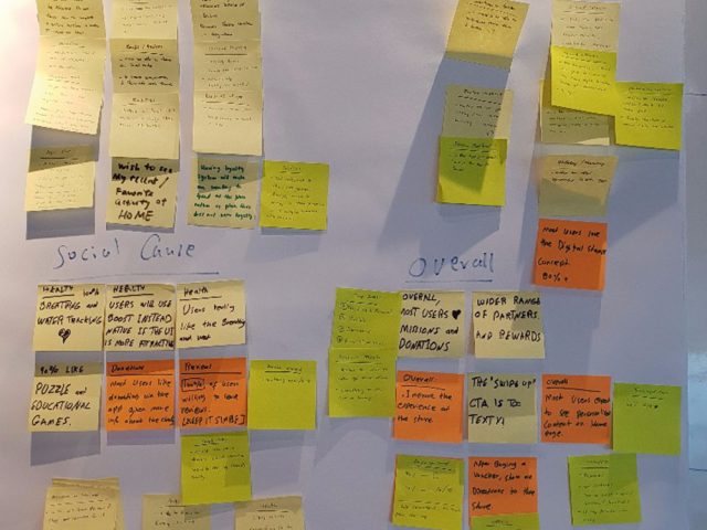
Since 2017, Boost’s app experience has not been changed. Here are the key problems with the
core experience.


To work with the data science and engineering team to build a recommendation engine that automatically shows consumers the most relevant content based on their past purchase behavior, interests and most favored brands.
To ensure a proper design system is in place to reduce technical debt, and give our consumers a better, consistent experience.
We want to highlight our core product offerings that go beyond Deals with new products introduced. We aim to allow a habit-building & fast payment experience for our consumers while strengthening product discovery on the app.
To optimize internal operations, we will build scalable design components, which will work across Pay with Boost, Deals & eCards.
As this is a huge project, we released the new designs in phases. For confidentiality reasons, I have omitted the Incremental impact for these metrics.


Before we started designing, we deep dive into existing behavioral and purchase data of our users to understand them better. We also conducted a series of customer interviews.
We focused on identifying what is the goal that our customers use our product for.
We defined 3 user archetypes and mapped them to their respective jobs-to-be-done.


We conducted design sprints to facilitate collaboration between cross-departments. UX Designers, Product Managers and Creatives contributed their fresh ideas in this sprint. The purpose of these sprints is to align everyone on the same goal—To improve our consumer experience by solving our user's problems today.


We mapped each archetype to their user journey on the app, with their respective success metrics.On the left, we have the current user flow. On the right, a newly improved user flow.

We map each flow with the percentage of tap events.


I sketched multiple users flows to visualize ideas quickly. My focus at this stage is to diverge first, converge later. Here are some early sketches of the Brand page.

A sneak peeks into my early wireframes, mid-fidelity designs and drafts. The designs have gone through at least 30 iterations per screen. It is due to several reasons: Change in business direction, a pandemic, shift in the product roadmap, or simply to improve the user experience.
We want our home tab to be personalized to each user. These are the various designs I've tried and did not make the cut. It could be due to a number of reasons like unclear value proposition, cluttered designs, and lack of scalability.

A place for further exploration so users could discover something new and interesting. Instead of asking users what Boost product they want to use, ask them what they want to do first. One of our design principles is that each screen is a singular purpose. This is why we don't overwhelm the user with too much content on the Explore tab.

We show users a collection of recommended deals or shops to visit. We needed a scalable design so the future Operations Team can automatically create useful collections based on deal/shop tags and reduce manual work. This also makes it easier for users to browse related content all in one place.

The initial designs went through several user tests, discussions with operations, marketing, and business teams to ensure we have a friendly and scalable user experience.
I wish I could show you every single part of the process!
To validate our designs or test prototypes, we did usability testing with real users. Due to the pandemic, our customer interviews are done remotely.
We've tested the prototype with 17+ people in a controlled testing environment as well as the guerilla way.


Here's a detailed walkthrough of the revamped app.
Before the redesign, the app was cluttered, it had a lack of focus on Boost’s core products. Now, Boost has a fresh new modern look and a better experience. To improve our brand and product perception, we introduced new, scalable components, redesigned micro-interactions, and repositioned the product.
Lucid is a scalable design system that saves time, reduces technical debt over time. It solves the problem of inconsistent components and user experience.
Lucid consists of 100+ components with properly defined typography styles, icons and illustrations. Everything in the app is made up of these modular components—this gives a unified, consistent, robust UI.
The design system is never final. It evolves as we go along!

The content you see is now more relevant. We collaborated with the data science and engineering team to implement full personalization of the user experience to show you content based on past purchase behavior and interests.
The prominent QR scanner on the bottom menu has a 31% increase in usage.

The old 'Nearby' tab is replaced with 'Explore'. While it wasn't an easy decision to make, people can now navigate to discover new things easily. The detailed breakdown is below.

To encourage discovery, we reduced the friction when switching categories and products. With products as the main tab, people are aware of Boost's other products.

Having a dedicated entry point to eCards also means users can discover eCards across multiple categories with a swipe.

We have separated content into 3 pages for easier navigation. Social proof is also more prominent now, with the key brand information displayed upfront like cashback amount, Pay with Boost button, opening hours, ratings, price range, and user's available cashback.

Besides making the photos more prominent, I rearranged the information on the Deal page to tell a better story. Based on customer feedback, there is a lack of trust in deals. So, I paid extra attention to improving the trust through social proof, ratings and reviews, and displaying the most important information upfront to give clarity.
Now, highly-rated reviews with a lengthy description will be shown first so it is more helpful for users than reviews with no comments.

Previously, people are unclear of the value of eCards, how to use it and where to utilize their bonus cashback. After several rounds of user testing to improve the messaging, pricing and discoverability, it has resulted in 41% increase in conversion rate.
People should feel like they're engaged in a conversation with Boost.
I designed the illustrations for a delightful experience. Empty states, error states and loading screens are often the most overlooked, so I gave these screens more love.

One of the most exciting features we've launched. Now, people can access to instant game credit top-ups for their favourite games such as Mobile Legends, PUBG, Ride Out Heroes, and more.

People typically favorite deals to compare them for later or favorite a shop for quick access so they can pay faster.

We needed to stay grounded and focused on the goal but also account for changes to the product to match the changed behavior of customers during the pandemic.
With a major user experience revamp, our internal processes are affected. For example, the operations team needs to change how they tag offerings or our merchandise.
If we didn’t collaborate with these teams, listened to their concerns, and evolved the tools they worked with, our beautiful app revamp would look nice only as a prototype, but fall flat once implemented in production. Hence, we had a lot of alignment initiatives going on in the background, such as re-defining our brand guidelines.
We learned to break down complicated designs into small, manageable chunks. This eases development and handles bugs as we go along.
For a project of this scale, even though we have already fixed plenty of bugs before public release, there are bound to be minor bugs.
This is a crucial next step for every UX improvement or product launch. With informed, actionable insights, we are able to design a better experience for our consumers.
To follow through with our product roadmap and continue to stick to our design principles.
This has been my proudest contribution to BLISS Studio and Boost Product Team. I couldn't have done so without the amazing team at Boost and BLISS! Huge appreciation to our heroes in the product engineering team, our QA team, and the data science team.
Thank you for reading through! Hope you enjoyed learning about my design and thought process. :)
